Conversation


TreeViewItem accepts `tooltip` and `popover` props, following the SideNav / AppBar precedent of overlays as props (TreeView only accepts TreeViewItem children, so wrapping an item in <Tooltip>/<Popover> is not possible). - `tooltip` wraps the treeitem row: opens on hover and keyboard focus, and is linked through aria-describedby. The row keeps its title as its name. - `popover` opens on mouse hover only, for rich previews. It is anchored on an aria-hidden box inside the row and controlled from the row's pointer events, because Popover writes aria-expanded on its trigger, which would overwrite the tree's own expanded state. It does not open on touch screens, where a tap only selects the row. Both default to placement="right". Also updates the blade-mcp TreeView doc. Co-Authored-By: Claude Opus 5.5 <noreply@anthropic.com>


🦋 Changeset detectedLatest commit: 8b91253 The changes in this PR will be included in the next version bump. This PR includes changesets to release 2 packages
Not sure what this means? Click here to learn what changesets are. Click here if you're a maintainer who wants to add another changeset to this PR |
 github-actions
Bot
added
blade
github-actions
Bot
added
blade

|
(Review Cancelled - Superseded by a new run) |
|
(Review Cancelled - Superseded by a new run) |

🛡️ Coverage ReportSummaryFull Coverage Details |
The knowledgebase drift check fails on types a doc uses but never defines. Inline the placement types and declare SpacingValueType locally, the same way the Popover doc does. Co-Authored-By: Claude Opus 5.5 <noreply@anthropic.com>
…er' into feat/treeview-item-tooltip-popover
|
(Review Cancelled - Superseded by a new run) |
![rzp-slash[bot]](https://avatars.githubusercontent.com/u/7713209?s=60&v=4)

There was a problem hiding this comment.
✨ Agentic PR Review ✨
UI Review
✅ 1 passed
Passing checks (1)
| Check | Screenshot |
|---|---|
| ✅ TreeView With Tooltip and Popover |  |
Usage
import { TreeView, TreeViewItem } from '@razorpay/blade/components';
<TreeView>
<TreeViewItem
title="Payment Success"
value="payment-success"
tooltip={{ content: 'Shown after a payment goes through' }}
/>
<TreeViewItem
title="Checkout"
value="checkout"
popover={{
title: 'Checkout',
content: <img src="/previews/checkout.png" alt="" />,
}}
/>
</TreeView>- Close the hover popover after motion.delay.xquick instead of immediately, so the pointer can cross the gap from the row onto the popover. The popover is portalled but is a React child of the row, so React keeps the row's pointerenter/pointerleave firing while the pointer is over it. - Ignore click / focus / mousedown / mouseup events on the row whose DOM target is outside the row. They bubble in from the popover through the React tree, so clicking popover content selected the row. - Declare `placement` on `tooltip` / `popover` with `@default 'right'` instead of inheriting Tooltip's / Popover's `@default "top"` via Pick. - Log the tooltip + popover dev warning once, from an effect. - Tests: crossing the gap keeps the popover open, clicks inside it do not select the row, a row is selected on the first click while a popover is open, and the warning is logged once. Co-Authored-By: Claude Opus 5.5 <noreply@anthropic.com>
|
(Review Cancelled - Superseded by a new run) |
 kamaleshs-bridge4
left a comment
kamaleshs-bridge4
left a comment
kamaleshs-bridge4
left a comment
There was a problem hiding this comment.
✨ Agentic PR Review ✨
UI Review
✅ 10 passed
Passing checks (10)








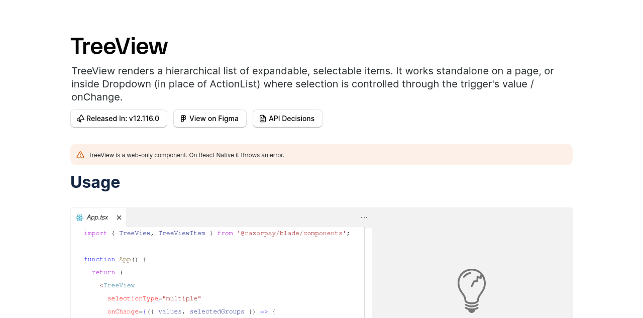
Usage
import { TreeView, TreeViewItem } from '@razorpay/blade/components';
<TreeView>
<TreeViewItem
title="Payment Success"
value="payment-success"
tooltip={{ content: 'Shown after a payment goes through' }}
/>
<TreeViewItem
title="Checkout"
value="checkout"
popover={{
title: 'Checkout',
content: <img src="/previews/checkout.png" alt="" />,
}}
/>
</TreeView>…popover is open
- Popover gains an internal `_isModal` prop (default true, so every existing
Popover is unchanged). TreeViewItem passes `_isModal={false}`: a modal
Popover sets aria-hidden on everything outside it, which hid the whole tree
from screen readers while the pointer rested on a row.
- Test: the tree and its rows stay accessible while a popover is open.
- Document why the tooltip's `aria-label: undefined` works (Tooltip's
cloneElement spread order) and which test guards it.
- Write the `tooltip` prop type as Pick<TooltipProps> & {...}, matching
`popover`.
Co-Authored-By: Claude Opus 5.5 <noreply@anthropic.com>
|
(Review Cancelled - Superseded by a new run) |
github-actions
Bot
added
the
Human Help Needed 🧑🏻💻

kamaleshs-bridge4
left a comment
kamaleshs-bridge4
left a comment
There was a problem hiding this comment.
✨ Agentic PR Review ✨
Status: Approved ✅
UI Review
✅ 6 passed
Passing checks (6)




Usage
import { TreeView, TreeViewItem } from '@razorpay/blade/components';
<TreeView selectionType="single">
<TreeViewItem
title="Payment Success"
value="payment-success"
leading={<CheckCircleIcon />}
tooltip={{ content: 'Shown after a payment goes through' }}
/>
<TreeViewItem
title="Checkout"
value="checkout"
leading={<LayoutIcon />}
popover={{
title: 'Checkout',
content: <img src="/previews/checkout.png" alt="" />,
maxWidth: 'spacing.80',
onOpenChange: ({ isOpen }) => console.log(isOpen),
}}
/>
</TreeView> kamaleshs-bridge4
added
the
rcore:eligible-for-auto-approval
kamaleshs-bridge4
added
the
rcore:eligible-for-auto-approval
…verlap Moving the pointer down the tree showed the previous tooltip / popover fading out under the next one (popovers also waited their 160ms hover-bridge delay). - Tooltip: skip the transition during the delay group's instant phase, as floating-ui recommends. A tooltip replaced by the next one in the group disappears at once; the first still fades in and the last still fades out. Applies to every grouped Tooltip, not only TreeView. - TreeViewItem popovers join BladeProvider's FloatingDelayGroup (the Tooltip group), so opening a popover or tooltip closes whichever one is open. A replaced popover is unmounted instead of fading out. Only items with a `popover` subscribe to the group. - Leaving a row for another row closes its popover at once instead of after the hover-bridge delay (the pointer is not heading to the popover). - Popover: replace the internal `_isModal` with `_shouldManageFocus` (default true). TreeView turns focus management off entirely: non-modal mode rendered floating-ui's focus guards (role=button, tabindex=0) and an aria-owns span inside the row, adding tab stops and renaming the row after the popover content while it was open. - Tests: popover/tooltip/mixed switches leave one overlay within 100ms (shorter than the 200ms exit animation), row-to-row closes without delay, and the axe audit also runs with a popover open. Co-Authored-By: Claude Opus 5.5 <noreply@anthropic.com>
|
(Review Cancelled - Superseded by a new run) |
kamaleshs-bridge4
left a comment
kamaleshs-bridge4
left a comment
There was a problem hiding this comment.
✨ Agentic PR Review ✨
UI Review
✅ 2 passed
Passing checks (2)
| Check | Screenshot |
|---|---|
| ✅ TreeView HoverPreview story | 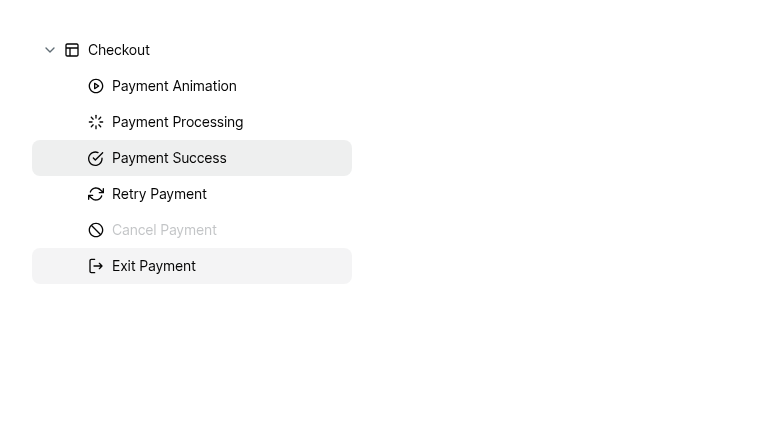 |
| ✅ TreeView Sizes story (regression check) | 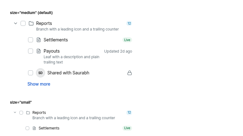 |
Usage
import { TreeView, TreeViewItem } from '@razorpay/blade/components';
<TreeViewItem
title="Payment Success"
value="payment-success"
tooltip={{ content: 'Shown after a payment goes through' }}
/>
<TreeViewItem
title="Payment Processing"
value="payment-processing"
popover={{ title: 'Payment Processing', content: <img src={preview} alt="" /> }}
/>
|
(Review Cancelled - Superseded by a new run) |
kamaleshs-bridge4
left a comment
kamaleshs-bridge4
left a comment
There was a problem hiding this comment.
✨ Agentic PR Review ✨
UI Review
✅ 2 passed
Passing checks (2)
| Check | Screenshot |
|---|---|
| ✅ TreeView With Tooltip and Popover | 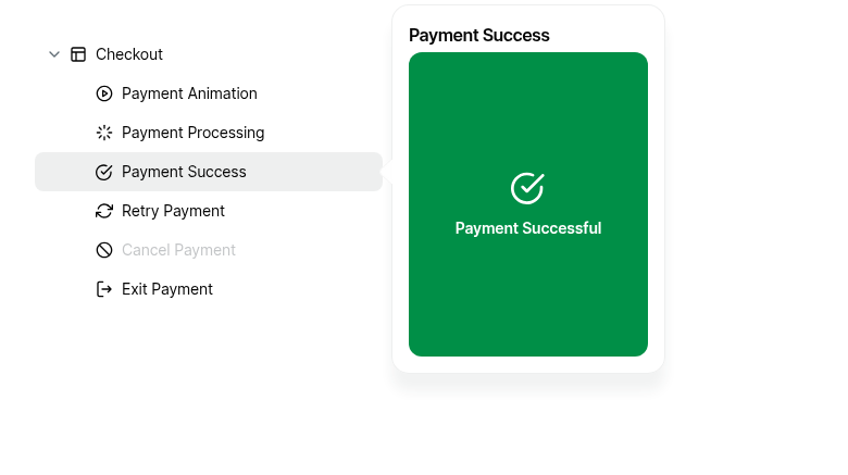 |
| ✅ Popover Switching Between Hover Popovers | 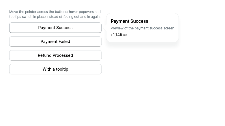 |
Usage
import { TreeView, TreeViewItem } from '@razorpay/blade/components';
<TreeViewItem
title="Payment Success"
value="payment-success"
leading={<CheckCircleIcon />}
tooltip={{ content: 'Shown after a payment goes through' }}
/>
<TreeViewItem
  title="Payment Success"
  value="payment-success"
  popover={{ title: 'Payment Success', content: <img src={preview} alt="" /> }}
/>… explain the minor bump - The in-place switch test checked, inside one 100ms window, both that the replaced popover was gone and that the new one had a 0ms transition. Popover applies its transition styles on the next animation frame, which can land after 100ms on a slow CI machine. The removal check keeps the 100ms window (shorter than the 200ms fade it guards against); the transition value check uses the default timeout. - Changeset: state that hover popovers being modal was unintended (the modal setting was hard-coded for every popover), which is why this ships as a minor release, and describe the one keyboard difference. Co-Authored-By: Claude Opus 5.5 <noreply@anthropic.com>
…frame timing

Same fix as in the Popover branch: the check that the replaced popover is
gone keeps its 100ms window (shorter than the 200ms fade it guards
against), while the check that the new popover opened with a 0ms
transition waits the default timeout. Popover applies transition styles on
the next animation frame, which landed after 100ms on CI (Run Tests (4)).

Co-Authored-By: Claude Opus 5.5 <noreply@anthropic.com>
|
🤖 Slash AI Review has been triggered. View execution logs |
|
(Review Cancelled - Superseded by a new run) |
The switching tests checked that a replaced overlay is gone within a real
100ms window, which failed on a busy CI machine ("popover back to tooltip"
chains a 1ms tooltip open delay and a 0ms close). They now advance fake
time by a fixed 100ms (shorter than the 200ms exit animation), in 10ms
steps so timers scheduled by React updates in one step fire in the next.
Each still fails with Popover's hover group or the Tooltip tweak disabled.

Co-Authored-By: Claude Opus 5.5 <noreply@anthropic.com>
The two switching tests checked that a replaced overlay is gone within a
real 100ms window, which can fail on a busy CI machine (the same test
shape failed on #4038). They now advance fake time by a
fixed 100ms (shorter than the 200ms exit animation), in 10ms steps so
timers scheduled by React updates in one step fire in the next. Each
still fails with the hover group, the close delay or the Tooltip tweak
disabled.

Co-Authored-By: Claude Opus 5.5 <noreply@anthropic.com>
|
(Review Cancelled - Superseded by a new run) |
There was a problem hiding this comment.
✨ Agentic PR Review ✨
UI Review
✅ 9 passed
Passing checks (9)


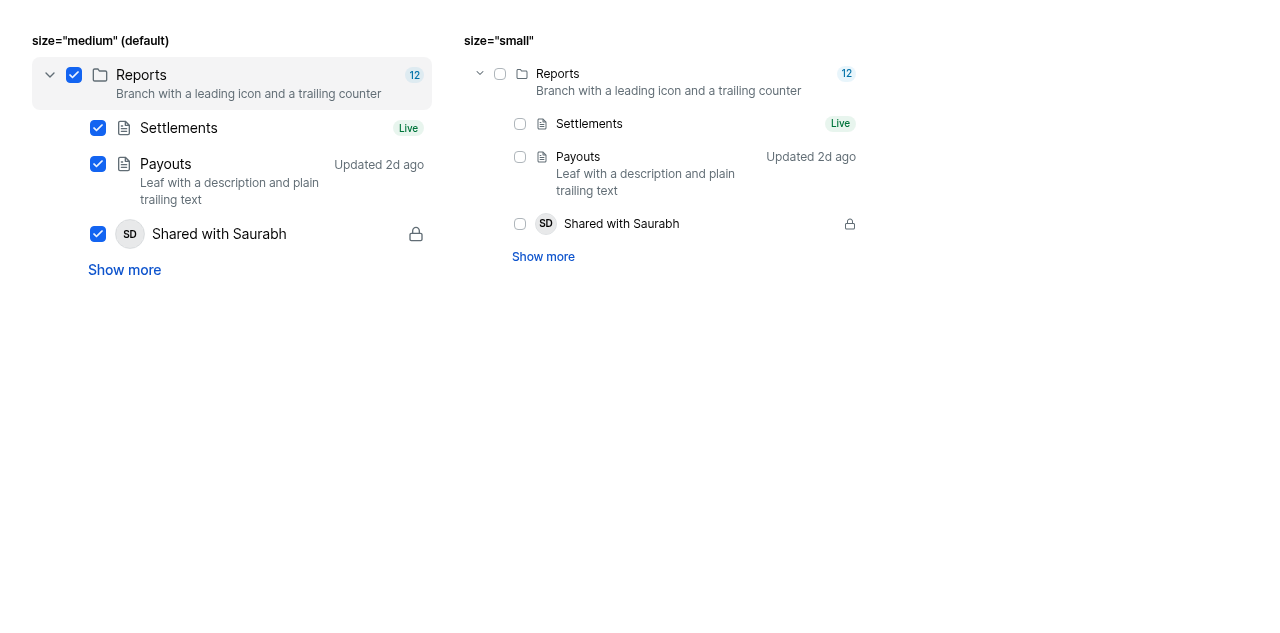
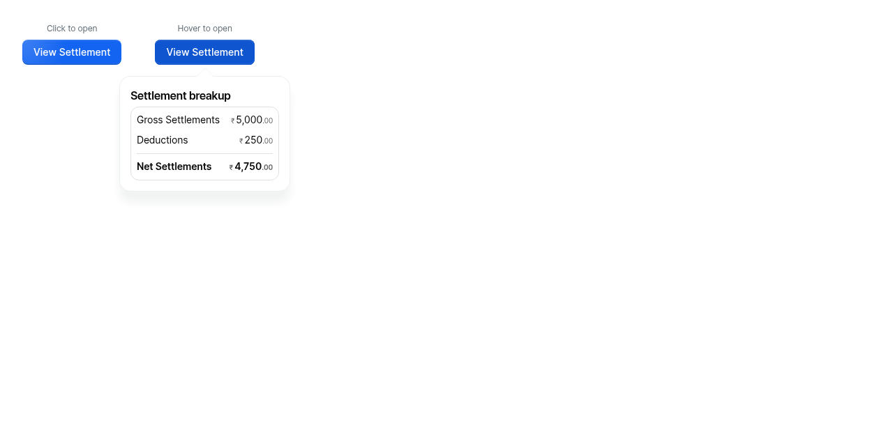
Usage
import { TreeView, TreeViewItem } from '@razorpay/blade/components';

<TreeView>
  <TreeViewItem
    title="Payment Success"
    value="payment-success"
    tooltip={{ content: 'Shown after a payment goes through' }}
  />
  <TreeViewItem
    title="Retry Payment"
    value="retry-payment"
    popover={{
      title: 'Retry Payment',
      content: <img src="/previews/retry.png" alt="" />,
    }}
  />
</TreeView>
There was a problem hiding this comment.
✨ Agentic PR Review ✨
UI Review
✅ 2 passed
Passing checks (2)
| Check | Screenshot |
|---|---|
| ✅ TreeView With Tooltip and Popover | 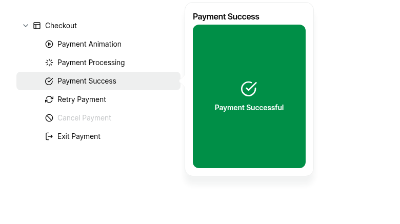 |
| ✅ Popover Switching Between Hover Popovers | 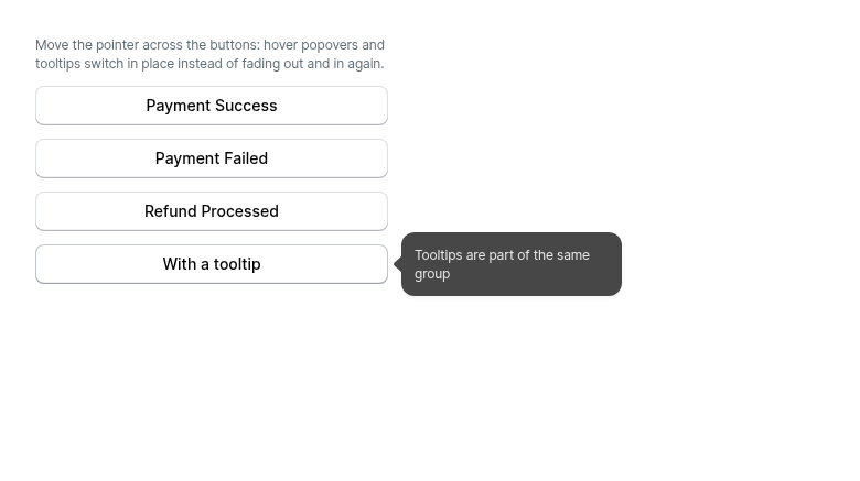 |
Usage
import { TreeView, TreeViewItem } from '@razorpay/blade/components';

<TreeView>
  <TreeViewItem
    title="Payment Success"
    value="payment-success"
    tooltip={{ content: 'Shown after payment goes through' }}
  />
  <TreeViewItem
    title="Payment Success"
    value="payment-success"
    popover={{ title: 'Payment Success', content: <img src={preview} alt="" /> }}
  />
</TreeView>
* feat(Popover): switch hover popovers and tooltips in place

Hover popovers join BladeProvider's FloatingDelayGroup, the group every
Tooltip is in, so moving the pointer between hover overlays switches them
in place instead of fading out and in again.

- Popover (openInteraction="hover" only): joins the delay group with its
  own floating context. Opening one closes whichever overlay is showing;
  the replaced one closes with a 0ms transition and the new one opens with
  a 0ms transition during the group's instant phase. Controlled popovers
  are asked to close through onOpenChange. A close request that arrives
  before the popover has claimed the group (mounted open, or opened in the
  same update) is ignored.
- Hover popovers are no longer modal: they do not trap focus or mark the
  rest of the page aria-hidden.
- Hover popovers close 80ms after the pointer leaves the trigger (instead
  of immediately), so the next overlay can replace them in place; moving
  onto the popover cancels the close.
- Tooltip skips its transition during the instant phase, as floating-ui
  recommends.
- Click popovers are unchanged and stay out of the group.
- Story, tests (real timers), changeset and blade-mcp Popover doc.

Co-Authored-By: Claude Opus 5.5 <noreply@anthropic.com>

* fix(Popover): make the hover switch test independent of frame timing; explain the minor bump

- The in-place switch test checked, inside one 100ms window, both that the
  replaced popover was gone and that the new one had a 0ms transition.
  Popover applies its transition styles on the next animation frame, which
  can land after 100ms on a slow CI machine. The removal check keeps the
  100ms window (shorter than the 200ms fade it guards against); the
  transition value check uses the default timeout.
- Changeset: state that hover popovers being modal was unintended (the
  modal setting was hard-coded for every popover), which is why this ships
  as a minor release, and describe the one keyboard difference.

Co-Authored-By: Claude Opus 5.5 <noreply@anthropic.com>

* test(Popover): run the hover switching tests on fake timers

The two switching tests checked that a replaced overlay is gone within a
real 100ms window, which can fail on a busy CI machine (the same test
shape failed on #4038). They now advance fake time by a
fixed 100ms (shorter than the 200ms exit animation), in 10ms steps so
timers scheduled by React updates in one step fire in the next. Each
still fails with the hover group, the close delay or the Tooltip tweak
disabled.

Co-Authored-By: Claude Opus 5.5 <noreply@anthropic.com>

---------

Co-authored-by: Claude Opus 5.5 <noreply@anthropic.com>
#4044 (hover popovers join the tooltip delay group) is
squash-merged into master, so this branch now takes it from master. The
only Popover change left in this PR is the internal `_shouldManageFocus`
prop TreeView needs (its popover trigger sits inside a treeitem).

- Conflict in Popover.web.tsx: keep `disabled={!_shouldManageFocus}`
  on FloatingFocusManager; everything else is master's.
- TreeView changeset: reference #4044 instead of "the
  Popover changeset", which ships separately.

Co-Authored-By: Claude Opus 5.5 <noreply@anthropic.com>
|
(Review Cancelled - Superseded by a new run) |
TreeView.web.test.tsx and PopoverHoverGroup.web.test.tsx (from
#4044) each defined the same helpers. Move them to
~utils/testing/overlayTransitions and import them in both:

- REPLACED_OVERLAY_TIME: 100ms, shorter than the 200ms exit animation
- advanceTime: advances jest fake timers in 10ms steps, so timers
  scheduled by React updates in one step fire in the next
- getOpenTransitionDuration: reads a popover's computed
  transition-duration

No test behaviour changes.

Co-Authored-By: Claude Opus 5.5 <noreply@anthropic.com>
|
(Review Cancelled - Superseded by a new run) |
There was a problem hiding this comment.
✨ Agentic PR Review ✨
Status: Approved ✅
UI Review
✅ 7 passed
Passing checks (7)







Usage
import { TreeView, TreeViewItem } from '@razorpay/blade/components';

<TreeView selectionType="single">
  <TreeViewItem
    title="Payment Success"
    value="payment-success"
    popover={{ title: 'Payment Success', content: <img src={preview} alt="" /> }}
  />
  <TreeViewItem
    title="Payment Processing"
    value="payment-processing"
    tooltip={{ content: 'Shown while the bank confirms' }}
  />
</TreeView>Review question: an item popover is portalled outside DropdownOverlay, so would a press inside it (e.g. a footer button) be an outside press for the Dropdown's useDismiss and close it? It is not: floating-ui's useDismiss also checks the React tree, and the popover is a React child of the row inside the overlay. The new test opens a TreeView in a SelectInput Dropdown, clicks a footer button in an item popover, and checks the button handler runs, the Dropdown and popover stay open, and nothing is selected (it fails without the row's event-target guard). Co-Authored-By: Claude Opus 5.5 <noreply@anthropic.com>
|
(Review Cancelled - Superseded by a new run) |
saurav12
added
Approved by Blade Designers 💅🏼
There is no use case for a plain-text tooltip on tree items yet, so
TreeViewItem only offers `popover` (the hover preview). This also removes
the "both tooltip and popover passed" case raised in review.

- Remove the `tooltip` prop, TreeViewItemTooltip, the Tooltip aria-label
  workaround and the both-props dev warning.
- Story "With Hover Preview": every previewable row uses `popover`.
- Tests: drop the tooltip-only and tooltip switching tests; the popover
  tests (incl. popover-to-popover switching and the Dropdown click test)
  stay.
- decisions.md B13 records why TreeView uses a prop instead of wrapping in
  <Popover> and why there is no tooltip prop; blade-mcp doc and changeset
  updated (changeset renamed to treeview-item-popover.md).

Co-Authored-By: Claude Opus 5.5 <noreply@anthropic.com>
|
🤖 Slash AI Review has been triggered. View execution logs |
saurav12
changed the title
kamaleshs-bridge4
left a comment
kamaleshs-bridge4
left a comment
There was a problem hiding this comment.
✨ Agentic PR Review ✨
UI Review
✅ 9 passed
Passing checks (9)








Usage
import { TreeView, TreeViewItem } from '@razorpay/blade/components';

<TreeView>
  <TreeViewItem
    title="Payment Success"
    value="payment-success"
    popover={{ title: 'Payment Success', content: <img src={preview} alt="" /> }}
  />
</TreeView>This branch has not been deployed
3 participants


Description
Tree view items can now show a Popover preview on hover. The main use case is a rich preview next to a row, e.g. hovering "Payment Success" in a checkout-screens tree shows a thumbnail of that screen to the right. Moving the pointer from row to row switches previews in place, without fading out and in again.
Builds on #4044 (merged), which made hover popovers switch in place with tooltips and each other.
Changes
New
TreeViewItemproppopover(title,titleLeading,content,footer,placement,maxWidth,onOpenChange): opens on mouse hover only.placement="right", so it doesn't cover the rows the pointer moves to next.tooltipprop: there's no use case for a plain-text tooltip on tree items yet. It can be added the same way later if one comes up.Moving between rows
Popover (internal only)
_shouldManageFocusprop (defaulttrue, so no other Popover changes). TreeView turns focus management off; see below.Other
_decisions/decisions.md(B13 and switching), blade-mcpTreeView.md, changeset.Additional Information
Why a prop, not
<Popover><TreeViewItem /></Popover>: TreeView only acceptsTreeViewItem/TreeViewLoadMorechildren and reads their props to build the tree, so a wrapper hides the item from it. No Blade parent that reads its children's props supports wrapping today (ActionList, Tabs, Breadcrumb, SegmentedControl). A wrapped Popover would also open on click by default and writearia-expandedon the row, so TreeView would have to silently override the consumer's Popover props. This follows theSideNavLink/AppBarprecedent of overlays as props.How the popover is attached: the treeitem row can't be Popover's trigger, because Popover writes
aria-expanded/aria-haspopuponto its trigger. That would overwrite a branch's expanded state and make leaves announce as collapsed branches. A wrapper around the row also fails axe (aria-allowed-attr, andaria-required-childrenonrole="tree"). So the Popover is controlled from the row's own pointer events and anchored on anaria-hidden,pointer-events: nonebox inside the row. Rows withoutpopoverrender exactly as before, and existing snapshots are unchanged.Why focus management is off for item popovers: since #4044, hover popovers are non-modal, so they no longer hide the page from screen readers. A non-modal popover with focus management, though, renders floating-ui's focus guards (
role="button",tabindex="0") and anaria-ownsspan next to its trigger. Here the trigger is inside the treeitem, so that would add tab stops to the row and make its accessible name include the popover's content. A hover preview never takes focus, so_shouldManageFocus={false}turns it off.Why the popover is mouse-only:
pointerType === 'mouse'onpointerenter. It uses pointer events rather than mouse events because browsers fire emulated mouse events after a tap.Because of both limits, popover content must never be the only place information lives. This is documented on the prop.
Testing
TreeView.web.test.tsx: hover, tree semantics untouched, reaching the popover and clicks inside it, first click while a popover is open, touch, axe audit with the popover closed and open, and three row-switching tests (popover to popover, in-place switch with a 0ms transition, early close when moving to a plain row). Plus one test inTreeViewDropdown.web.test.tsx: clicking inside an item popover in a Dropdown keeps the Dropdown open and selects nothing.~utils/testing/overlayTransitions.Component Checklist
🤖 Generated with Claude Code